30 June 2020
Media Studies
Research - Film Company Logos
•
1. Disney
Disney first began way back in 1923, and instantly became pre-eminent in the film-making and entertainment industry. With his brother's help, Walt Disney designed and created two cartoon shorts, Alice and Oswald the Lucky Rabbit, to be the logo for Disney, and both were initially successful. However, Walt Disney failed to protect the legal copyright of both characters, thereby losing the contract to them in February 1928.
Walt Disney then proceeded to design and create a character called Steamboat Willie which presented a mouse character which then later became known as Mickey Mouse. This character was an excellent success, and therefore Walt Disney Productions was formed around it in 1929.
The very first, original Disney logo revealed the figure of Mickey Mouse. The logo was then animated in all of Disney's films and shows to revolve and change colours. Later in 1995, the logo was transformed into what was the base for the current Disney logo now. This logo featured a light blue castle with the text "Walt Disney Pictured" typed across it and was the official Disney logo right up until 2006, when it was then transformed once again to form the current logo... An "incredibly impressive in its detail" logo which presents Cinderella's castle with balconies, towers and a moat.

This logo has become the signature of Disney, one which leads people to instantly think of Disney when they see it.
The History of Disney and their Logo
2. Universal Studios
Walt Disney then proceeded to design and create a character called Steamboat Willie which presented a mouse character which then later became known as Mickey Mouse. This character was an excellent success, and therefore Walt Disney Productions was formed around it in 1929.
The very first, original Disney logo revealed the figure of Mickey Mouse. The logo was then animated in all of Disney's films and shows to revolve and change colours. Later in 1995, the logo was transformed into what was the base for the current Disney logo now. This logo featured a light blue castle with the text "Walt Disney Pictured" typed across it and was the official Disney logo right up until 2006, when it was then transformed once again to form the current logo... An "incredibly impressive in its detail" logo which presents Cinderella's castle with balconies, towers and a moat.
This logo has become the signature of Disney, one which leads people to instantly think of Disney when they see it.
The History of Disney and their Logo
2. Universal Studios

The Universal Pictures logo, founded in 1912, has been part a long-lasting part of Hollywood history for many years.
The studio's very first logo displayed a plane circling around the rotating earth, and as time progressed, cloudy rings were added around the planet.
The most recent logo is a CGI creation which reveals a highly life-like depiction of the earth in reality, pictured below.

The studio's very first logo displayed a plane circling around the rotating earth, and as time progressed, cloudy rings were added around the planet.
The most recent logo is a CGI creation which reveals a highly life-like depiction of the earth in reality, pictured below.
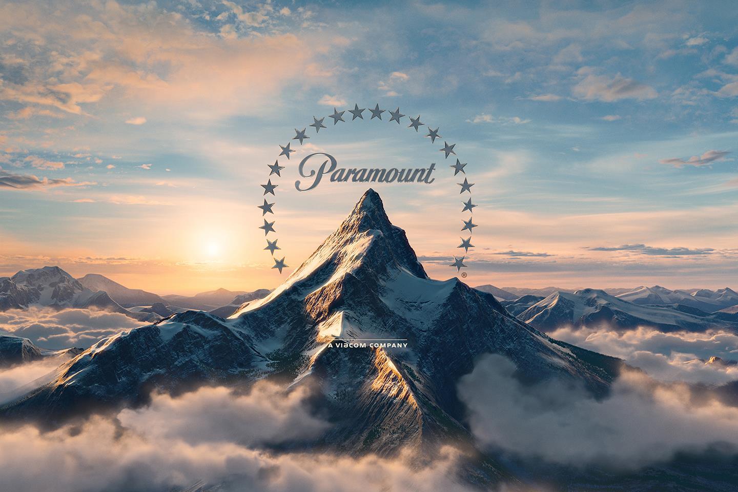
3. Paramount: The Majestic Mountain

The Paramount corporation was founded by Adolph Zukor back in 1912, and the 'Majestic Mountain' logo was drawn by W.W. Hodkinson during a meeting with Zukor. This mountain was actually based on the Ben Lomond mountain from his childhood in Utah, and is the "oldest surviving Hollywood film logo."
The number of stars surrounding the mountain used to be 24 to resemble the 24 contracted movie stars, however the logo now only has 22 stars. The reason for the decrease in the number of stars is not very clear.
The matte painting pictured above was also adjusted to a computer generated one, pictured below.
The matte painting pictured above was also adjusted to a computer generated one, pictured below.
4. DreamWorks SKG: Boy on the Moon
Jeffrey Katzenberg - the studio chairman of Disney, director Steven Sielberg, and David Geffan - a record producer, joined and together founded a new studio; DreamWorks in 1994. The 'SKG' resembles the initials of each of the men.
Speilberg' desire was for the logo to have a look of Hollywood's golden age. One of a man on the moon, fishing. However, Visual Effects Supervisor Dennis Muren suggested that a hand-painted logo would appear more professionally. Robert Hunt, Muren's friend, was asked to paint the logo.
Hunt sent through two options, one being of a young boy sitting on a crescent moon and fishing, and Spielberg actually preferred this option. The young boy is actually Hunt's son, William!
5. Warner Bros.
The Warner Bros. logo has always looked relatively the same, appearing as though it hasn't changed at all over the years. According to this website, the "emblem you see at the beginning of a movie today seems virtually identical to the one you would have seen 60 years ago." However, in reality, the Warner Bros. logo has indeed experienced many adjustments over the span of the last century.
Here is a photo of the very first Warner Bros, logo:
This logo was created way back in the 1920s, and it displayed "the motif of the Warner Bros. logo" for the following 90 years! As evident in the above photo, this first initial logo placed the letters of WB at the bottom half of the shield, revealing a photo of the film studio's Burbank branch.
In the most recent 200 years, there have been up to 200 changes to this logo, forming the current logo today;

How did this logo come about:
- Later in the 1920s, and in the 1930s, the initials of "WB" became the focus of the logo, the photo of the Burbank branch being removed.
- In November 1966, Jack Warner actually sold Warner Bros. to Seven Arts.
- One of the major logo variations here was to drop the "B" and have the "W"'s ascender bend into a seven instead. This version of the logo only lasted four years.
- The logo was then changed t resemble something similar to a logo of a petrol station.
- Later, Warner now initiated that the company either removes that specific version of the logo from all films completely, or replace it with their current logo.
- The logo then returned to it's symbolic look, and Saul Bass was then employed in 1972 to rebrand. He designed a logo of a very 'Nazi-looking' vibe.
- This logo was many people's favourite, but was returned back to the more classic, symbolic logo in the mid-1980s.
"Filmmakers have always been encouraged to tailor it [the logo] to suit the individual tone of their films."
In the 1990s, the rise and creation of CGI lead to the designing of the logo rocketing in creativity. "Great design is timeless, but it's also adaptable."

The original and very first 21st Century Fox logo was designed by Emil Kosa Jr., a matte artist who also proceeded to paint the Statue of Liberty in Plant of the Apes in 1968, and the music which sometimes played as the logo appeared, the "Fox Fanfare", was composed by Alfred Newman in 1933. This logo was then redesigned using CGI and computer technology in 1994 and 2008, and today looks like the logo pictured above.
When creating a logo [like our GCH Productions logo]:
- Remember that great "design is timeless, but it's also adaptable." Basically, be pen to adapting the logo when need be. Be open to alternatives and slight changes. For example, the DreamWorks logo is what it is today because Spielberg was open to the suggestions of those assisting in the process.
- Bring a sense of creativity and excitement to the process, drawing up many drafts and designs in effort of finding the best, most beautiful and well-suiting option of logo to represent the company.
- TEAMWORK. Include the team in the process. The more people contributing, the more ideas discussed and the more likely it is to create a stunning, unique logo.
- First try out a matte painting/matte option of the logo, and then a CGI option to see which you prefer. For example, Speilberg actually ended up preferring the matte version for the DreamWorks logo, even though he initially wanted a Hollywood look and feel by CGI.
I personally love the idea of having a lion, a friendly-looking lion, to be our logo. However, with some thought and discussion with our team, we decided that perhaps this would be too similar to Lionsgate's logo. Chene Harris, one of the members in our team, then took control of the designing of the logo, and she, together with Hunter Look, designed a blue and red triangle as the logo. This was the logo we used in our Preliminary Task 2, linked below:

In the most recent 200 years, there have been up to 200 changes to this logo, forming the current logo today;
How did this logo come about:
- Later in the 1920s, and in the 1930s, the initials of "WB" became the focus of the logo, the photo of the Burbank branch being removed.
- In November 1966, Jack Warner actually sold Warner Bros. to Seven Arts.
- One of the major logo variations here was to drop the "B" and have the "W"'s ascender bend into a seven instead. This version of the logo only lasted four years.
- The logo was then changed t resemble something similar to a logo of a petrol station.
- Later, Warner now initiated that the company either removes that specific version of the logo from all films completely, or replace it with their current logo.
- The logo then returned to it's symbolic look, and Saul Bass was then employed in 1972 to rebrand. He designed a logo of a very 'Nazi-looking' vibe.
- This logo was many people's favourite, but was returned back to the more classic, symbolic logo in the mid-1980s.
"Filmmakers have always been encouraged to tailor it [the logo] to suit the individual tone of their films."
In the 1990s, the rise and creation of CGI lead to the designing of the logo rocketing in creativity. "Great design is timeless, but it's also adaptable."
6. 21st Century Fox
The original and very first 21st Century Fox logo was designed by Emil Kosa Jr., a matte artist who also proceeded to paint the Statue of Liberty in Plant of the Apes in 1968, and the music which sometimes played as the logo appeared, the "Fox Fanfare", was composed by Alfred Newman in 1933. This logo was then redesigned using CGI and computer technology in 1994 and 2008, and today looks like the logo pictured above.
When creating a logo [like our GCH Productions logo]:
- Remember that great "design is timeless, but it's also adaptable." Basically, be pen to adapting the logo when need be. Be open to alternatives and slight changes. For example, the DreamWorks logo is what it is today because Spielberg was open to the suggestions of those assisting in the process.
- Bring a sense of creativity and excitement to the process, drawing up many drafts and designs in effort of finding the best, most beautiful and well-suiting option of logo to represent the company.
- TEAMWORK. Include the team in the process. The more people contributing, the more ideas discussed and the more likely it is to create a stunning, unique logo.
- First try out a matte painting/matte option of the logo, and then a CGI option to see which you prefer. For example, Speilberg actually ended up preferring the matte version for the DreamWorks logo, even though he initially wanted a Hollywood look and feel by CGI.
I personally love the idea of having a lion, a friendly-looking lion, to be our logo. However, with some thought and discussion with our team, we decided that perhaps this would be too similar to Lionsgate's logo. Chene Harris, one of the members in our team, then took control of the designing of the logo, and she, together with Hunter Look, designed a blue and red triangle as the logo. This was the logo we used in our Preliminary Task 2, linked below:
For our final Foundation Portfolio, I suggested to the team that we change our logo to a more symbolic, classic one, and Hunter Look offered to take on this role. From discussion, he has informed Chene Harris and I that he aims to use a Chinese dragon as the animal on the logo, with the initials of 'GCH Productions' written in Chinese letters/a Chinese-looking font. Chene Harris and I are yet to see what this looks like.
Helping with the logo (contributing ideas):
examples as inspiration:
We would most definitely quite like perhaps some colour? Not too much colour though - to keep it professional-looking. I suggested to Hunter Look that we go for more practical, classic colours for our logo; perhaps blue and black, because when observing the logos of many other film studios such as Warner Bros. and Disney, practical colours for the logo seem to look stunning. Hunter Look took this advice on board and seems to be flying with it.
We are using Wix and Photoshop to create our logo, and will then use Adobe After Effects to create an excellent transition for the logo to appear on the screen.
Just as 21st Century Fox's logo is accompanied by their iconic music soundtrack, we might accompany our logo with a piece of music as well so that it might become iconic to our films, and people will therefore associate that soundtrack with our production company.
This comment has been removed by the author.
ReplyDeleteHi Grace
ReplyDeleteOverall Score: 19/20
- A really thorough breakdown of the logo-creating process, well done! You have reserached well and drawn very sensible, useful conclusions that will help you shape and design your own group logo.
- Just make sure you embed imagery properly so it shows on your blog post.