Showing posts with label Research. Show all posts

Monday, June 29, 2020

Film Company Logos

Grace Watson
30 June 2020
Media Studies
Research - Film Company Logos

•


1. Disney
The Disney logo and all there is to know about the Walt Disney brand
Walt Disney's Logo - LogoDix
Disney first began way back in 1923, and instantly became pre-eminent in the film-making and entertainment industry. With his brother's help, Walt Disney designed and created two cartoon shorts, Alice and Oswald the Lucky Rabbit, to be the logo for Disney, and both were initially successful. However, Walt Disney failed to protect the legal copyright of both characters, thereby losing the contract to them in February 1928.

Walt Disney then proceeded to design and create a character called Steamboat Willie which presented a mouse character which then later became known as Mickey Mouse. This character was an excellent success, and therefore Walt Disney Productions was formed around it in 1929.

The very first, original Disney logo revealed the figure of Mickey Mouse. The logo was then animated in all of Disney's films and shows to revolve and change colours. Later in 1995, the logo was transformed into what was the base for the current Disney logo now. This logo featured a light blue castle with the text "Walt Disney Pictured" typed across it and was the official Disney logo right up until 2006, when it was then transformed once again to form the current logo... An "incredibly impressive in its detail" logo which presents Cinderella's castle with balconies, towers and a moat.
The History of Disney and their Logo Design | LogoMyWay Blog
This logo has become the signature of Disney, one which leads people to instantly think of Disney when they see it.

The History of Disney and their Logo


2. Universal Studios
Universal Celebrates Centennial With New Logo, Social Campaign
The Universal Pictures logo, founded in 1912, has been part a long-lasting part of Hollywood history for many years.
The studio's very first logo displayed a plane circling around the rotating earth, and as time progressed, cloudy rings were added around the planet.
The most recent logo is a CGI creation which reveals a highly life-like depiction of the earth in reality, pictured below.
Universal to Debut New Studio Logo in Front of 'Dr. Seuss' The ...


3. Paramount: The Majestic Mountain
Paramount Pictures/Logo Variations | Logopedia | Fandom

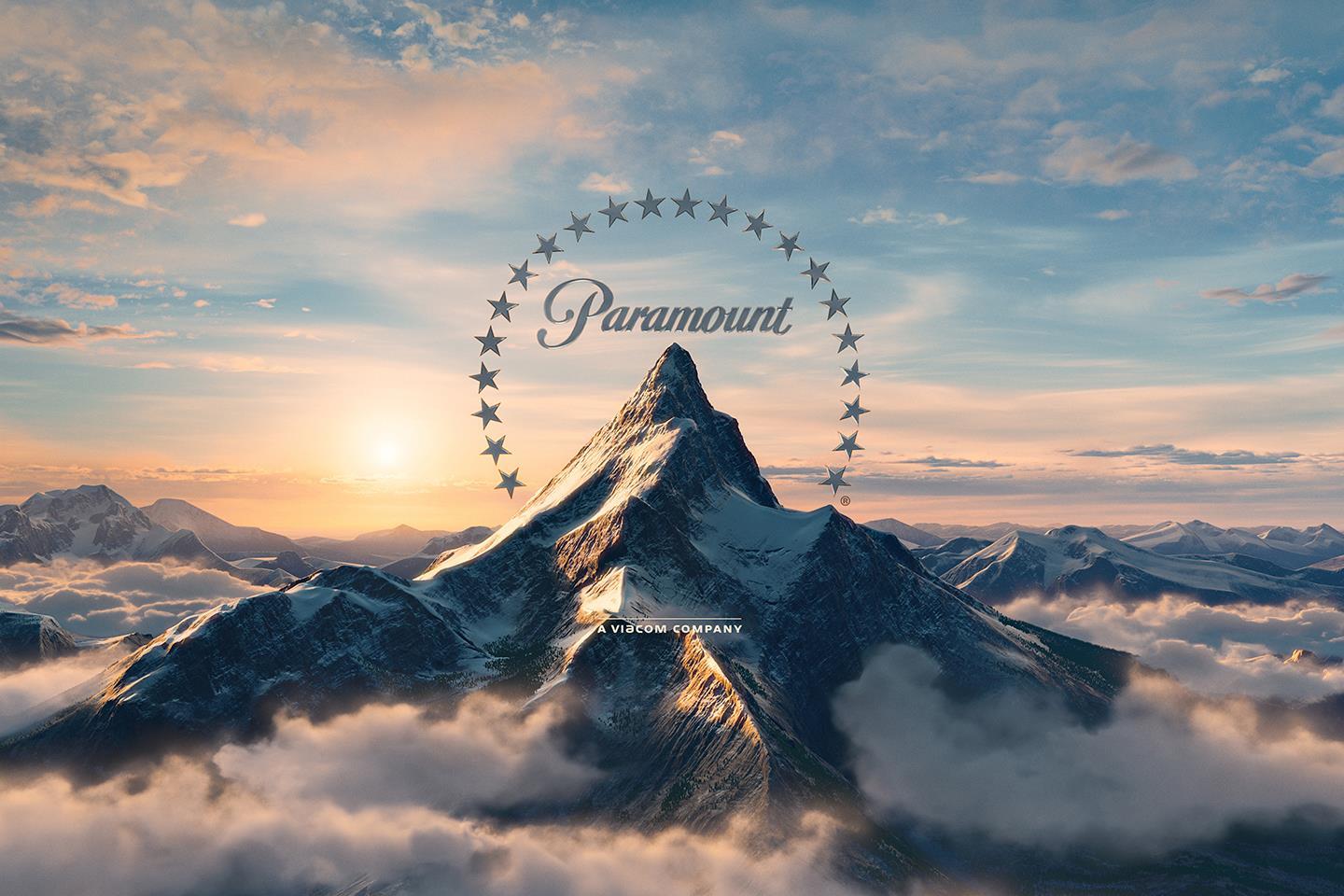
The Paramount corporation was founded by Adolph Zukor back in 1912, and the 'Majestic Mountain' logo was drawn by W.W. Hodkinson during a meeting with Zukor. This mountain was actually based on the Ben Lomond mountain from his childhood in Utah, and is the "oldest surviving Hollywood film logo."

The number of stars surrounding the mountain used to be 24 to resemble the 24 contracted movie stars, however the logo now only has 22 stars. The reason for the decrease in the number of stars is not very clear.
The matte painting pictured above was also adjusted to a computer generated one, pictured below.
Paramount names Eugene Yang SVP theatrical for Asia Pacific | News ...


4. DreamWorks SKG: Boy on the Moon
DreamWorks Animation - Wikipedia

Jeffrey Katzenberg - the studio chairman of Disney, director Steven Sielberg, and David Geffan - a record producer, joined and together founded a new studio; DreamWorks in 1994. The 'SKG' resembles the initials of each of the men.
Speilberg' desire was for the logo to have a look of Hollywood's golden age. One of a man on the moon, fishing. However, Visual Effects Supervisor Dennis Muren suggested that a hand-painted logo would appear more professionally. Robert Hunt, Muren's friend, was asked to paint the logo.
Hunt sent through two options, one being of a young boy sitting on a crescent moon and fishing, and Spielberg actually preferred this option. The young boy is actually Hunt's son, William!

DreamWorks Animation Inks Distribution Deal with Fox | Hollywood ...


5. Warner Bros.
Examining Warner Bros' Franchise Slate | Den of Geek
The Warner Bros. logo has always looked relatively the same, appearing as though it hasn't changed at all over the years. According to this website, the "emblem you see at the beginning of a movie today seems virtually identical to the one you would have seen 60 years ago." However, in reality, the Warner Bros. logo has indeed experienced many adjustments over the span of the last century.

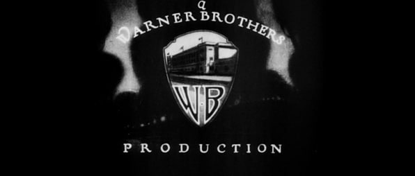
Here is a photo of the very first Warner Bros, logo:
The Surprising History Of The Warner Bros. Logo
This logo was created way back in the 1920s, and it displayed "the motif of the Warner Bros. logo" for the following 90 years! As evident in the above photo, this first initial logo placed the letters of WB at the bottom half of the shield, revealing a photo of the film studio's Burbank branch.

In the most recent 200 years, there have been up to 200 changes to this logo, forming the current logo today;
Warner Bros. Logo: 100-Year History | Logaster

How did this logo come about:
- Later in the 1920s, and in the 1930s, the initials of "WB" became the focus of the logo, the photo of the Burbank branch being removed.
- In November 1966, Jack Warner actually sold Warner Bros. to Seven Arts.
- One of the major logo variations here was to drop the "B" and have the "W"'s ascender bend into a seven instead. This version of the logo only lasted four years.
- The logo was then changed t resemble something similar to a logo of a petrol station.
- Later, Warner now initiated that the company either removes that specific version of the logo from all films completely, or replace it with their current logo.
- The logo then returned to it's symbolic look, and Saul Bass was then employed in 1972 to rebrand. He designed a logo of a very 'Nazi-looking' vibe.
- This logo was many people's favourite, but was returned back to the more classic, symbolic logo in the mid-1980s.

"Filmmakers have always been encouraged to tailor it [the logo] to suit the individual tone of their films."

In the 1990s, the rise and creation of CGI lead to the designing of the logo rocketing in creativity. "Great design is timeless, but it's also adaptable."


6. 21st Century Fox
Disney ditches Fox name from branding, emails and logos
The original and very first 21st Century Fox logo was designed by Emil Kosa Jr., a matte artist who also proceeded to paint the Statue of Liberty in Plant of the Apes in 1968, and the music which sometimes played as the logo appeared, the "Fox Fanfare", was composed by Alfred Newman in 1933. This logo was then redesigned using CGI and computer technology in 1994 and 2008, and today looks like the logo pictured above.


When creating a logo [like our GCH Productions logo]:
- Remember that great "design is timeless, but it's also adaptable." Basically, be pen to adapting the logo when need be. Be open to alternatives and slight changes. For example, the DreamWorks logo is what it is today because Spielberg was open to the suggestions of  those assisting in the process.
- Bring a sense of creativity and excitement to the process, drawing up many drafts and designs in effort of finding the best, most beautiful and well-suiting option of logo to represent the company.
- TEAMWORK. Include the team in the process. The more people contributing, the more ideas discussed and the more likely it is to create a stunning, unique logo.
- First try out a matte painting/matte option of the logo, and then a CGI option to see which you prefer. For example, Speilberg actually ended up preferring the matte version for the DreamWorks logo, even though he initially wanted a Hollywood look and feel by CGI.


I personally love the idea of having a lion, a friendly-looking lion, to be our logo. However, with some thought and discussion with our team, we decided that perhaps this would be too similar to Lionsgate's logo. Chene Harris, one of the members in our team, then took control of the designing of the logo, and she, together with Hunter Look, designed a blue and red triangle as the logo. This was the logo we used in our Preliminary Task 2, linked below:

For our final Foundation Portfolio, I suggested to the team that we change our logo to a more symbolic, classic one, and Hunter Look offered to take on this role. From discussion, he has informed Chene Harris and I that he aims to use a Chinese dragon as the animal on the logo, with the initials of 'GCH Productions' written in Chinese letters/a Chinese-looking font. Chene Harris and I are yet to see what this looks like.
Helping with the logo (contributing ideas):
examples as inspiration:
Production+Logo+Ideas.PNG (687×622) | Film company logo, Company ...
We would most definitely quite like perhaps some colour? Not too much colour though - to keep it professional-looking.  I suggested to Hunter Look that we go for more practical, classic colours for our logo; perhaps blue and black, because when observing the logos of many other film studios such as Warner Bros. and Disney, practical colours for the logo seem to look stunning. Hunter Look took this advice on board and seems to be flying with it.

We are using Wix and Photoshop to create our logo, and will then use Adobe After Effects to create an excellent transition for the logo to appear on the screen.
upload.wikimedia.org/wikipedia/commons/thumb/c/...

Just as 21st Century Fox's logo is accompanied by their iconic music soundtrack, we might accompany our logo with a piece of music as well so that it might become iconic to our films, and people will therefore associate that soundtrack with our production company.




Sunday, June 14, 2020

Creating suspense using music

Grace Watson
15 June 2020
Media Studies
Creating suspense using music

•

Music is a really important, useful way to build up fear and suspense within the viewers.

Three steps/ideas to choosing fantastic music pieces:

1. Use strings to raise the tension.
- layering strings can make an innocent scene suspenseful and scary - uncomfortable.
- choose your instruments wisely.

2. Raise the tempo, raise the heart rate.
- playing a fast-tempo song over an almost 'normal' scene hints to the audience that something is wrong.
- you're basically reflecting the fast heartbeats of the viewers in the fast-paced tempo of the piece.

3. Use crescendo to turn tension into revulsion.
Revulsion -> a sense of disgust and loathing.
Crescendo -> slowly raising the intensity of the music until the climax occurs.
- a 'theremin' is an instrument which adds an unearthly feel to the scene - can really be used in this sense.

|||

For my personal video/production, I may include a few ambiance sounds of string instruments into the first few shots as they relate to the fact that an otherwise innocent scene of a child being at a park is now suspenseful and strange because of both the background song and the questionable man. I also plan to really raise the tempo and thereby mimic the heartbeat of the audience specifically in the chase scene by overlapping a more suspenseful, intimidating and fast-paced song over the current eerie song as to increase the adrenaline of the viewers. Finally, there is already a sense of tension turning into revulsion when the man chases the young girl. Where initially the audience worried about and questioned what was happening between the two characters, they then become disgusted and completely torn apart as the child is chased, grabbed, thrown over the shoulder and carried to the car. This could be amplified using crescendo, by raising the intensity of the music right up to the point where the man begins chasing after the young girl.

Monday, April 20, 2020

Case Studies

Grace Watson
21 April 2020
Media Studies
Case Studies

•


New Zealand's population in 2019 = 4.917 million (this is an estimate).
USA's population in 2019 = 328.2 million.


1. A Hollywood Blockbuster - Jurassic World

- production companies: Universal Pictures, Legendary Entertainment, Amblin Entertainment, The Kennedy/Marshall Company.
- directed by Colin Trevorrow.
- distributed by Universal Pictures.
- stars Chris Pratt, Bryce Dallas Howard, Ty Simpkins, Nick Robinson and Katie McGrath etc.
- production budget was $150 million USD.
- released on the 12th of June 2015.
- release details:
= Jurassic World was released in 60+ countries on the 10th of June and in the USA on the 12th of June 2015.
= massive release in most cinemas.
- opening weekend Box Office numbers: it had a record breaking opening weekend, becoming the first film to ever gross over $500 million USD.
- from the 20th of October 2015 the film was on disc and streaming.
- reviews: the film was adored specifically for "Trevorrow's direction, Pratt and Howard's performances, and the visuals", however it was criticized for some parts of the "screenplay and narrative, according to according to Wikipedia.
- Jurassic World's marketing strategy was to build up anticipation for the film via any platform, to ultimately attract and convince people to buy a movie ticket. They kept their website clean, fresh and easily understandable, did not over-post and annoy viewers on social media. This strategy was a SUCCESS with the movie's record breaking open weekend and MANY sales on Box Office.
Because of it being a large Hollywood blockbuster film, the marketing department of the film had a  larger marketing budget than many other films, and could spend more money on their advertising and promoting of the film.
- synergy and cross-media convergence:
= adverts and trailers on platforms such as the adverts of other movies in cinema were released and broadcast-ed as a form of advertising the film. this was very successful.
= Jurassic World has many rides in Universal Studios.
= it imprints it's logo and dinosaurs onto objects such as phone cases, laptop carriers, water bottles, notebooks etc for sale to spread the movie and brand's awareness.
= designed video games based on the film.
= distributes and sells pieces of clothing, such as t-shirts and sweaters, which have characters, dinosaurs and the film's name imprinted on them.
= sells toys which resemble characters from the film (such as toy dinosaurs).
= Jurassic World was actually a sequel - therefore there was most probably already an audience who had watched and enjoyed the first film, Jurassic Park, and were coming back for more of the enjoying experience.
- Piracy numbers: the number of times Jurassic World was pirated is not evident on the internet, however it can be concluded that with it being such a largely supported and adored movie, there were most probably many cases. There are countless articles describing how Universal Studios actually ordered the removal of all pirated versions of the film from it's own servers, which is both interesting, and prove that the film would've been pirated by a number of individuals.


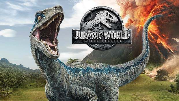
Classic Jurassic Park Cast Teased by Bryce Dallas Howard for ...
Jurassic World video game:
Jurassic World: The Game (Mobile Game) Trailer | Jurassic World ... 
Jurassic World toys:


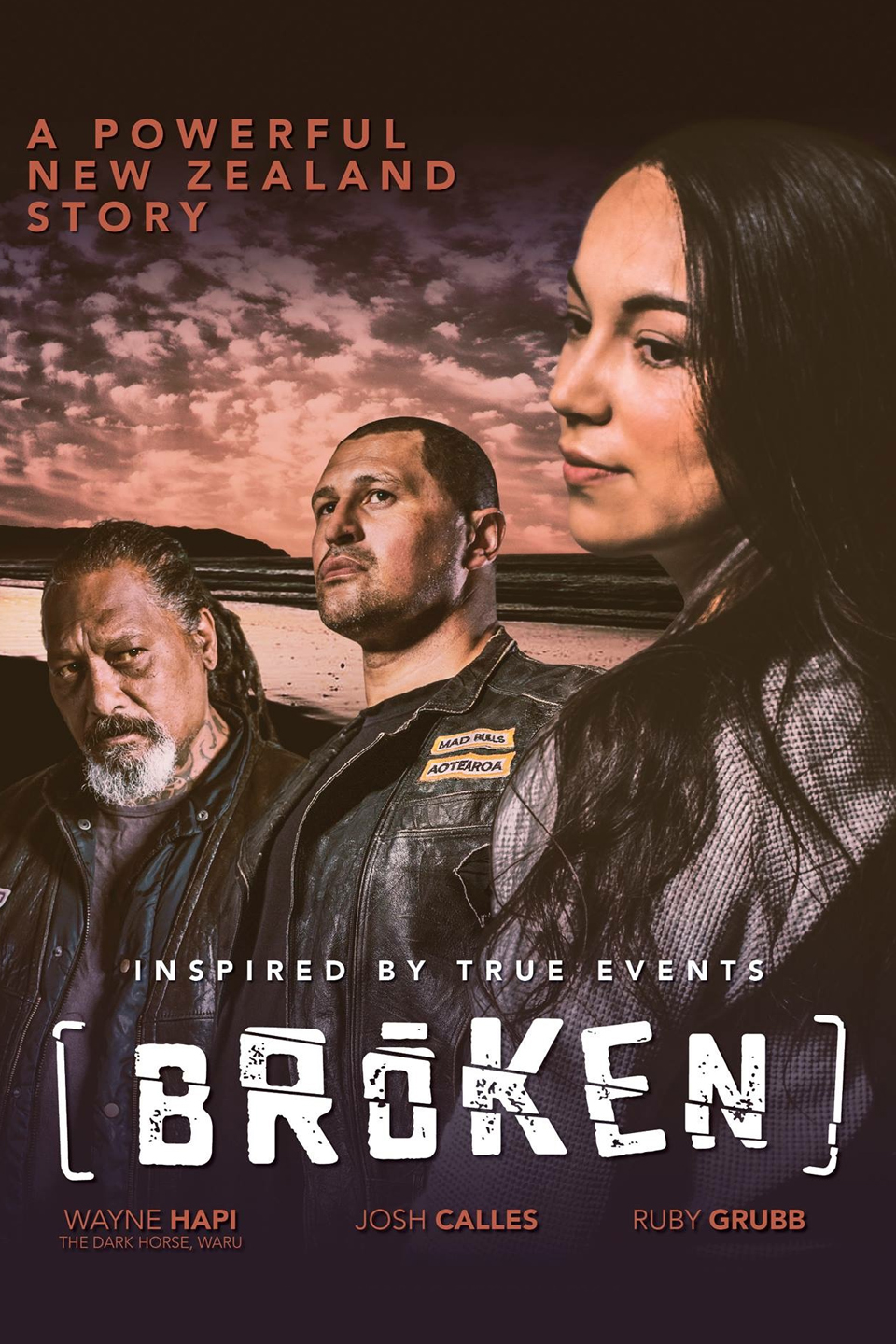
2. A New Zealand film - Broken


- released on the 1st of February 2018.
- directed by Tarry Mortlock.
- stars Joshua Calles, Wayne Hapi.
- production budget was $
- release details:
- reached $647 891 on Box Office.
- marketing strategy: ...
- synergy and cross media convergence:
= released a trailer on YouTube.
= advertised over social media, such as through Facebook posts.
= hasn't released any t-shirts or items displaying members of the cast or the movie's name - doesn't have many pieces of synergy - could be because it isn't a very large or extremely popular film - no need.
= Broken was released mainly in New Zealand, not a very massively popular film, hence not having a large marketing budget. Social media was the most suitable form of advertising for this film.
= no need to record songs and release a CD - mainly used already-existing songs on their soundtrack.
- Piracy numbers: according to the director, this film has been pirated approximately 200000 times. Even though the illegal sites keep getting shut down, new ones keep popping up and so therefore there is no one official source or site for the pirating to occur.

- 23 277 likes and 24 250 follows on Facebook.

contentserver.com.au/assets/643919_broken_v8.jpg


3. An independent/art-house film - My Happy Family

- directed by Nana Ekvtimishvili and Simon Grob.
- released and screened in the World Cinema Dramatic Competition section of the Sundance Film Festival on the 22nd of January 2017.
- then had it's world premiere in the Forum section at the 67th Berlin International Film Festival.
- DISTRIBUTED BY MEMENTO FILMS.
- cast -> starred Ia Shugliashvili.
- production budget was 
- was screened in the World Cinema Dramatic Competition section of the 2017 Sundance Film Festival.
- it is now available on Netflix, and has been since ....
- reached $428 468 in Box Office sales.
- marketing strategy: 
= not a blockbuster film, hence perhaps not having a large marketing budget. Social media was the most suitable form of advertising for this film.
- synergy and cross media convergence:
= hasn't released any t-shirts or items displaying members of the cast or the movie's name - doesn't have many pieces of synergy - could be because it isn't a very large or extremely popular film - no need. It is an art-house film, therefore the audience is generally an older, more mature audience, who wouldn't typically be very interested in purchasing clothing with the names of a movie imprinted on them.
= no need to record songs and release a CD - mainly used already-existing songs on their soundtrack.
- Piracy numbers: just like the film 'Broken', the number of times it was pirated is not easily discover-able on the internet. This is most probably because it is an Indie, art-house and independent film as opposed to a large blockbuster. It is neither funded by a very large production company or film studio, nor a very popular film worldwide. Art-house films are not as popular as normal cinema films, hence there being less of an audience, and thereby less of a chance of it being pirated. Secondly, the audience of an art-house is generally an older, more mature audience, and they are less aware of how to pirate films.

Check out “My Happy Family” on Netflix | My happy family, Happy ...


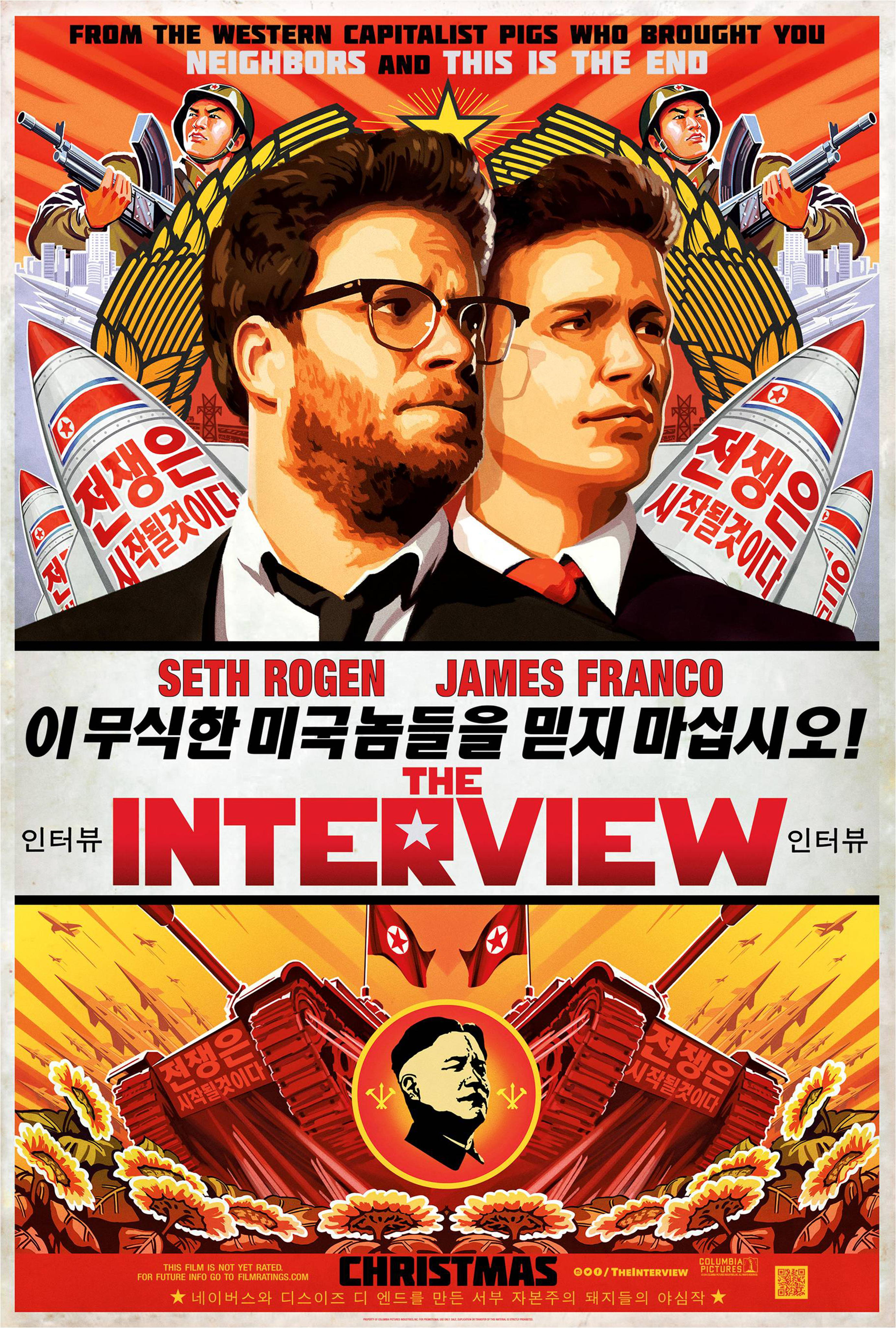
4. A film that didn't perform as well as expected - The Interview

- directed by Seth Rogen and Evan Goldberg.
- distributed by Sony Pictures Releasing.
- was released/premiered on the 11th of December 2014 and was scheduled to be released in England and Ireland on the 6th of February 2016.
- was not a success. This was because the North Korean government actually threatened to take action against the United States if the film was releases. Hence why Sony delayed the release from October to December.
They spent those two months making the film more acceptable to the North Korean government by re-editing the film. Sony cancelled all television advertising of the film.
- In the November of this time, a group known as the "Guardians of the Peace" who allegedly had ties to North Korea hacked Sony's computer systems. They even threatened terrorist attacks against theaters where the film was showing.
- Because of this, major theater chains decided not to release the film at their theaters and therefore Sony released it instead for online digital rental on 24 December 2014 and then a limited release to only limited theaters on the 25th.
- South Korean singer even claimed that Sony had used one of her songs without permission (which was sorted out in an agreement with Sony Pictures later on).
- generated $12.3 million on Box Office.
- grossed $40 million in digital rentals which made it Sony's most SUCCESSFUL digital release.
- marketing strategy:
= The Interview did not end up doing very well, therefore perhaps their marketing strategy was not the most effective. 

- synergy and cross media convergence:
= released a trailer which was put on YouTube and aired during the adverts before other films in cinemas.
= hasn't released any t-shirts or items displaying members of the cast or the movie's name - doesn't have many pieces of synergy - this could be due to the fact that it didn't end up doing very well on Box Office, not gaining as much support as expected.
= no need to record songs and release a CD - mainly used already-existing songs on their soundtrack.
- Piracy numbers: 
= pirated 1.5 million times in the first two days.
= downloaded illegally 750000 times on Christmas 2014 alone.
= downloaded on illegal sites like 'TorrentButler' thousands of times.

The Interview (2014) - Photo Gallery - IMDb

4. Another film that didn't perform as well as expected - Solo: A Star Wars Story

- released on the 10th of May 2018.
- directed by Ronald Howard.

Solo: A Star Wars Story | DVD | Buy Now | at Mighty Ape NZ


From doing some research, it is evident that the large Hollywood blockbuster film, Jurassic World, has the most information published about it, in comparison to the more national, less popular films such as Broken and My Happy Family. This relates to the fact that large blockbuster films have larger marketing budgets and can spend more money on their advertising and promoting of their film, whereas more Indie films, as well as art-house films may have lower budgets and less finance available for their advertising, reverting to the cost-effective use of social media to promote their film (such as Broken which released its trailer on YouTube and Facebook posts).


INSTITUTION: Disney
Disney's successful use of synergy and cross media convergence:
1. it distributes and sells pieces of clothing, such as t-shirts and sweaters, which have Disney characters and film names or sayings imprinted on them.
2. Disneyland.
3. Cars Land (in Disneyland).
4. Star Wars Land (in Disneyland).
5. Shipping and selling toys worldwide which represent and symbolise different Disney movie characters and objects, such as toy lightsabers (from Star Wars).
6. imprinting Disney logos, film names, character drawings etc. on objects such as phone cases, laptop carriers, water bottles, notebooks etc for sale to spread their brand's awareness.
7. designing video games based on films produced under the Disney institution, such as the 'Tangled' video game and the 'Infinity' video game.
8. Disney releases the songs from it's films onto music platforms or CDs for people to listen to and enjoy after the film, such as the High School Musical CD.
9. Disney forms DVD games and encore versions of it's films to further advertise and sell it's products/films.
10. Disney releases and broadcasts adverts and trailers on platforms such as the adverts of other movies in cinema as a form of advertising it's upcoming films. 


OWNERSHIP:

NZFC Research
  1. The NZFC is a government agency which aims to grow the New Zealand film industry. It supports both New Zealand and international stories with the main aim of telling the stories worldwide, balancing both “cultural and economic objectives to achieve successful outcomes for our industry and our people” according to their website.
  2. Daffodils, Born to Dance, Hunt for the Wilderpeople and Bellbird are all films that the NZFC have funded in the last five years that have done well internationally.
  3. The NZFC has funded movies such as The Breaker Upperers, Waru, Capital in the Twenty-First Century and Hunt which have all been successful and popular.
  4. To help NZ filmmakers in the production process, the NZFC invests finance into films and short films and their production process to assist in the extensive costs,  contributing production financing to between eight and twelve films each year. Additionally, the NZFC offers grants to and assists with co-productions. It also promotes NZ films both in NZ and overseas worldwide, as well as markets NZ’s screen production industry overseas to attract international productions to NZ. 
- helped fund 'Game of Thrones' which is worth a massive $2.28 billion!


Creating Suspense

Grace Watson
21 April 2020
Media Studies
Creating Suspense

•


Wednesday, March 11, 2020

Thriller sub-genres - Slideshow

Grace Watson
12 March 2020
Media Studies
Thriller sub-genres - Slideshow

•

Sunday, March 1, 2020

Opening Sequences

Grace Watson
2 March 2020
Media Studies
Opening Sequences

•

Opening Sequences provide the directors' of a film with a chance to express their own personal creativity. Their main purpose is to convey important and useful information regarding the cast and creative members involved in the production of a film to its audience. Quite regularly, opening sequences can be stories of themselves, whilst establishing the mood and visual character of a film. Encouraging anticipation and excitement within the audience who grow expectant for what is to come in the film, Opening Sequences introduce the viewer to varying elements that are to come in the film, such as location, themes, plot and characters etc. In general, Opening Sequences can be abstract, detailed, simple and complex, all for the effect of drawing in the viewer and revealing some elements to come as well as present the key information.

Opening Credits and Title Sequences are mostly used interchangeably as there are numerous situations in which the Title Sequences of a film are accompanied by Opening Credits. However, there are a few differences between the two.
Opening Credits are revealed as "text superimposed on a blank screen",  text over static pictures or even sometimes on text on top of action in the show. They are a list of credits shown consecutively.

Title Sequences, on the other hand, although similar, are more specifically methods used by the film crew to list names of the cast members, which will assist in establishing the overall tone and setting of the film. Title Sequences often use sound and visuals to do so, with the text of the opening credits.

Opening Sequences are often "stories in their own right". There are varying techniques that can be used in Opening Sequences for effect....
Research on techniques that can be used in opening sequences:
Link to website used:

                            Screenshot of the website where some key points were found:


The first technique which could be used, is the technique of having two-dimensional styled graphics in three-dimensional environments. Created and used by Daniel Kleinman, and used in the Opening Sequence of the film Casino Royale, this technique creates a contemporary look, as well as an absurd feel, which links to the fact that thrillers spark discomfort and fear within the viewer.


Another effective technique which can be employed in Opening Sequences, is the technique of freeze-framing whilst revealing layers of illustration with ink bleeding effects. "Ink bleeding" could spark connotation with blood, a typical and effective thriller convention. This technique was inspired by the vintage newspaper headlines and ink drawings, and was used, for example, by Danny Yount/Prologue in the film Sherlock Holmes.


Danny Yount


Thirdly; documentary style Opening Sequences, with smart editing and cinematography, can be used to portray a documentary style short film in its own right. Post Panic used this technique to create his own Opening Sequence. He saw it as his ‘passion project’, and successfully created an Opening Sequence on a very low budget, proving that this documentary style Opening can be effective on low budgets. 


Another great technique which can be used in Opening Sequences is the use of CGI (which involves modelling, rendering, animation and lighting etc.) such as in the case of Great Expectations by Nic Benns/Momoco. Here, Benns chose to use a three-dimensional butterfly with a prestigious title to keep the concept minimal and abstract - great idea. The butterfly’s birth and death resemble a metaphor for the lead character’s growth. The fact that the Opening Sequence has some significant link to the actual film is an effective technique for Opening Sequences.

Nic Benns:


CGI butterfly:


Saul Bass


A few decades ago when film first began, Title Sequences were officially presented information and static and copy-write images... all generally quite boring and repetitive.  Saul Bass completely changed and revolutionised the way people used Title Sequences in film, introducing the use of boldly and creatively presented information as well as inventive animation, establishing the mood, tone and texture of a film as well as Title Sequences which symbolise and summarise a films essence... all contributing towards creating a climax and building suspense (thriller convention).
He was quoted saying “Why not make it more?”... and so he did! Because of the pivotal point Saul Bass sparked in Media Studies, many of today’s sequence makers have him to thank for the inspiration.

Saul Bass did many of Hitchcock’s sequences.

Two of Hitchcock’s sequences include Skyfall and Vertigo, Skyfall being a more modern thriller.

Skyfall, a more modern thriller, was released in 2012, not too long ago. By this stage, the internet had advanced so there were resources and technology available to the directors for some amazing editing.
Included in Skyfall’s Title Sequence is dripping/gushing blood, graveyards, daggers and knives,  and guns dropping from higher in the water, all instruments that cause people to die, symbolic of death. The whole video is located [mise-en-scene] in a deep body of water. The character is being pulled further under by a large hand. This resembles sinking deep and being pulled down, linking back to the theme of death. It implies that death is coming for the character, sparking the question within the viewer of whether he is going to meet his fate, and die.

The main purpose of an Opening Sequence is to portray the character names and the names of key members involved in to making of the film, as well as to reveal some of the main themes within the film. Skyfall is successful in clearly depicting these names, whilst effectively blending them into the clip, so that they do not steel from it, but rather accompany it well, as well as it being effective in revealing a couple of themes. 


A sense/theme of resurrection and looking at the human being as being immortal is revealed through the character standing with a gun shot in his shoulder, yet still continuing to shoot others.  A girl is also depicted within the clip, holding a gun. She appears powerful, which is in complete contrast to the typical gender stereotypes that view woman as being more vulnerable and emotional and men being the more brave and powerful individuals.
Throughout the clip some sort of cultural references have been made, inferring that perhaps they may end up in China at some point. The unfamiliarity of China, along with the higher pitched parts of the song, along with the fact that the girl is powerful, opposite to general stereotype, all create a sense of uneasiness and question within the viewer.

The use of broken and smashed mirrors and reflections is effective in firstly, further stirring the uneasiness mentioned above, and secondly in building suspense. Mirrors are often associated with characters looking at themselves, self-reflection, however here, it seems as though the character is looking through the mirror, at the viewer. This is quite creepy, and stirs a sense of the character not being willing to improve his character, remain true to good conduct or be of good behaviour. It introduces to the viewer that perhaps he is a determined character.
The background music [sound] to the clip is Adele’s (the singer) voice which is generally deep and powerful, just as the water is deep and powerful in all its depths, creating a parallel/link. However, in some parts of the song, Adele’s voice does go almost squeaky or high-pitched, creating a contrast, which could lead to discomfort in the viewer, specifically in the high pitched parts of the song. It sparks a sense of strangeness. There is a link between the music's words and what is happening on screen, creating a sense of the Opening Sequence being its own film in its itself, a film about the song.

Another theme/symbol clearly coming through is the one of the eye, with a shot of zooming in to a close-up of an ice-blue eye. The harsh ice blue links to the character's determined manner. Following this shot a few shots later, is the zooming shot, into a close-up of a gun, drawing a relationship between the two. This could imply that the man is as rough as a gun, as powerful and dominant. unbeatable. This link was emphasised earlier where both the man and then the guns were depicted as falling deeper into the water.


Zooming in to the ice blue eye:

Zooming in to the gun:

Man falling deeper into the ocean:

Guns sinking deeper:


The whole Opening Sequence is effective in revealing the credits, as well as introducing a few early ideas regarding each character, such as the girls power, man's determination and so on.

Vertigo, on the other hand, is more old-fashioned than what Skyfall is, created in 1958. Here, there appears to be a theme of eyes, with numerous close-up shots from different angles of the eyes being the cover pictures used for Vertigo on Art of the Title, as seen below. 


The eyes revealed [mise-en-scene] in this clip, are similar to the close-up shot of the ice blue eyes in Skyfall, a similarity between the two clips. Both clips do have music, which is a similarity, however,  a difference is that in this clip, there is no voice along with the music [sound], whereas in Skyfall, along with the music was Adelle's powerful voice. The absence of a voice can lead to the build up of an eerie, freaky atmosphere, which is reinforced in the video by the close-up shot of the eye where the viewer cannot see what the girl is looking at which could spark question and a sense of fear in the viewer, typical of a thriller. Part of the definition of an eye according to Google, is that it is one of the "most important symbolic sensory organ"s, often being used as a gateway to the soul. The shots of the eye in Vertigo could perhaps reveal a few ideas regarding the soul of the character. She seems afraid and confused.

The lighing in Vertigo has a pale hue to it compared to Skyfall which had a much harsher red colouring. The harsh red of Skyfall links to it revealing determined characters, and the more pale lighting of Vertigo implies a theme of confusion. This confusion is emphasised in the eye movement and facial expressions of the girl, who seems slightly less confident and more reflective/worried than the powerful girl in Skyfall.

Where in Skyfall death was a theme proved by the symbols of knives, daggers and gun etc, spirals are a theme in Vertigo. The word 'Vertigo' itself, means the loss of balance and "sensation of whirling". The spirals resemble hypnotic images... it's as if the girl is hypnotised.


Example of a spiral from Vertigo:

                             
The filming and editing style of this Opening Sequence by Hitchcock, also creates a sense of the girl almost falling, with her confused, slightly worried facial expressions revealing that she is perhaps scared of heights. Her fear is in contrast to the fearlessness of the girl in Skyfall.

A final similarity, on the other hand, is that both clips reveal someone falling somehow. In Skyfall, the man in sinking deeper, and in Vertigo, the girl is falling deeper into confusion and hypnotism.

Man sinking deeper:

Girl falling deeper into confusion:


In both cases, each Opening Sequence has clearly depicted the important names and accompanied it with footage that gives the viewer some early insight into each film. Skyfall can be expected to be about determined, powerful characters, and Vertigo about confusion and worry. The different, and some similar techniques have achieved the above. 


Monday, February 17, 2020

Thriller Brainstorm, Rationale and Storyboard

Grace Watson
18 February 2020
Media Studies
Thriller Brainstorm, Rationale and Storyboard

•

Brainstorm:


Rationale:


The opening shot of the scene will be an establishing shot of the fun fair, at a wide angle to reveal more of the location (fun-fair). What can be seen within the camera shot (miss-en-scène), at this point, is a large bright red and white Ferris wheel and a colourful teacup ride on the left and a sweet/lolly shop toward the right. Amidst and in between these rides and the shop are clumps/groups of joyful people laughing, chatting, eating candy floss and popcorn etc. This is conveyed through smiling faces and the clear body language of clapping and jumping in joy etc., all symbols of gladness, often associated with the fun-fair, and all included within the establishing shot. The sky is bright blue - not a single cloud. This symbolises how it seems to be a perfect day, so there shouldn’t be any trouble. This is ironic as this feeling soon changes.

Whilst still depicting all of the above, the second shot will be a mid-shot, more closely zoomed in than before. It will reveal lots of people walking in numerous directions, emphasising business. When filming, people will walk straight/directly past and in front of the camera (almost like a close-up of their bodies as they pass or perhaps even an obstructed view shot of some sort). This creates a sense of the viewer being right there, standing at the fun-fair, people watching and experiencing the vibrant atmosphere which makes the scene feel more relatable.

At this point, the transitions between takes (editing) will be fades as they are more peaceful and relaxed transitions, mimicking how relaxed and joyful everyone at the fun-fair appears. The sound, initially, at this point, is light and fun, fitting for a fun-fair. The background music is delightful and the fun-fair is pictured as being noisy, rowdy and the sounds of people laughing, chatting, walking on the gravel between rides, screaming in pure exhilaration on the rides etc. can all be heard as the diegetic sound. The colours are bright and joyful. It’s day time and the afternoon sun is shining brightly overhead. The camera will alternate between shots of the people at the fun-fair, and will reveal their bright clothing - pinks, blues, yellows, greens - all bright colours resembling joy and lightness! The fun-fair, the location, is typically a place of pure delight and vibrant colour.

After another fade transition, there will then be a mid-shot of two children right next to each other eating candy floss (with clumps of people behind). This shot will then transition, quickly, to a close-up of one of them putting candy floss in their mouth and smiling. There’ll then be an extreme close-up (first main convention) of another child’s smiling eyes. These numerous shots of smiling eyes, happy hearts, eating candy floss all reveal and symbolise the joy being experienced and create an atmosphere of freedom and child-like happiness within the scene. The faster transitions, quick cuts, will be effective in creating a list-like feel of jam-packing the scene with cuts/shots of joyful people, carefree and life-loving.

At this point, the atmosphere seems light and carefree.... until, the camera fades from black to reveal a young man, aged thirty or so, standing rigidly in-between clumps of busy people (mid-shot). The sounds of laughter and joy die out and the background music, now non-diegetic, becomes eerie (second main convention). This ironic music choice (third main convention) will spark irony and question within the viewer and instantly cause a change in the atmosphere being detected. There will be a stark contrast between what the previous shots revealed, with the laughing, joyous, carefree, bubbly children and adults and the vibrant atmosphere with the light sounds and happy music, and the now eerie, strange music backing up a rigid, unfamiliar character who appears scary. A fun-fair should have background music like earlier; light and happy. The lighting will now also have a dark green tinge/hue to it, similar to the colour of the clown’s outfit (discussed later). This dark green is a symbol of trying to hide something I.e. blood. It enables the clown to his his true identity and agenda of being an abductor, as does it ‘hide’ the light and bright lighting of earlier shots. The change in music and lighting when depicting the man instantly sparks a sense of doubting his character.

The man (soon-to-be-abductor) has bright red hair, perfectly combed and gelled to the side, and sharp brown eyes. The colour red is associated with blood, and the sharp, rigidness of his character symbolises his harshness and unkind selfishness - sort of scary look. An extreme close-up (convention) of his eyes will highlight one eye having a shadow on it. Shadows (the fourth main convention) resemble hiding something. Something being hidden, uncertain, causes a sense of uncomfortableness in the viewer, further stirring up unpredictability. The transition will also be sharp.

The camera takes which depict the man/clown will be short takes with quick cuts, mimicking his rigidness, and stirring up an uneasiness. Where before the fades between shots allowed the viewer to really soak in each shot, the quick cuts now don’t... uncomfortable.

The camera will then zoom out (fifth main convention) to form a mid-shot, also handheld, as he places a clown mask on his face, once again something is hidden, causing fear in the viewer. The series of hiding something will cause a build up of fear. The camera will instantly cut to a zoomed out shot revealing his whole outfit - a clown outfit. The colour of his outfit will be a dark, deep green, similar to the colour worn by emergency doctors, a colour that tries to cover/hide the colour of blood. This is once again ironic as clowns are supposed to wear bright colours, and should generally, especially at a fun-fair, resemble glee and friendliness as they reach out to provide the children with an enjoyable experience, instead here the clown is accompanied by eerie music and is depicted as being strange and unsafe.

A point-of-view shot (sixth main convention) from the clown looking toward the people of the fun-fair will reveal a 180 degree scanning of the location, depicted by the panning of the camera to reveal the setting further. The camera angle will be canted (seventh main convention) which will, firstly, encourage the viewer to believe that something is very questionable and, secondly, symbolise how his character is unstable, unhealthy. The camera will also be handheld, further emphasising his instability.
The atmosphere will now be intense and bizarre.

After panning, the camera will focus on one little boy who is young and small. His hair will be white blond, resembling the purity of his youth, and he will appear scruffy, chocolate smudged across his face. This will all symbolise his carefreeness, and the fact that he is a child who has no worries. The high-angle shot of him will make him seem inferior and weak compared to the clown. His being without his mother who can be seen about ten metres behind him in the sweet/lolly shop queue unveils his being vulnerable and isolated (eight and ninth main conventions). The suspense will really begin to soar here as the viewer will begin to feel emotionally heartbroken for, and will want to save the child, having an idea of what is about to happen.

A wide-shot of the clown walking towards the young boy will convey a contrast in both height and safety between the two. The clown will begin slowly walking toward the young boy, speeding up with each step. The suspense will heighten with each tread made, and then suddenly the clown will put his hand out and pull the child as the camera blacks out dramatically. This will be accompanied by a loud and dramatic non-diegetic sound of a piano as well as the clashing of symbols. The scene will then end on a cliff hanger and the viewer will be left questioning what on earth has just happened.

Throughout the whole scene, the absence of actual conversation and dialogue causes the viewer to really pay attention to the changes in lighting, sound and mood which all three communicate quite clearly the irony and uneasiness of having the dark, strange and eerie character of the clown infringing on the bright and fun atmosphere of the fun-fair.


Storyboard: